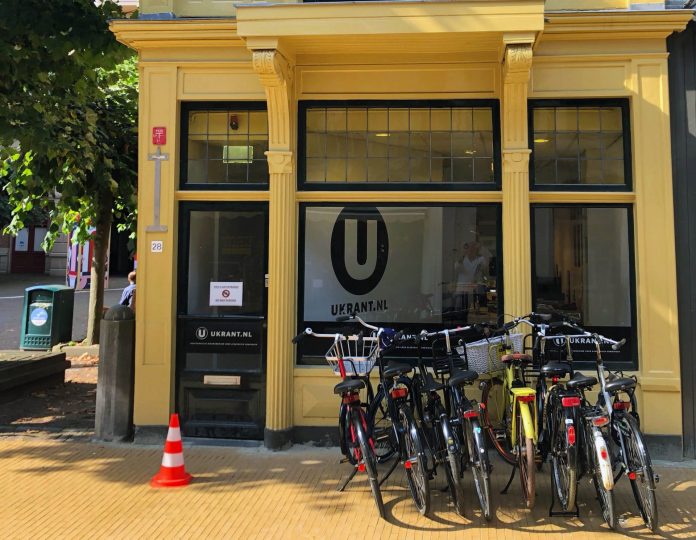
Every day, the editorial staff at UKrant wonders: What are we writing about, why are we writing about it, and how are we writing about it? A look behind the scenes.
Just in case you haven’t noticed yet: UKrant’s website was completely updated over the summer. It was necessary, too: the previous site had been launched in 2016, which means it’s basically prehistoric in internet terms. It was time for a new coat of paint.

Well, it’s a bit more than a coat of paint. We built an entirely new website with a completely different set-up, which we hope is is more organised and easier to navigate. Articles are divided across various sections consisting of blocks, which puts background article with background article, opinion with opinion, video with video, and science with science, etc.
The only exception is the first block, which collects the most important and current articles. The articles will automatically be moved to a new position in the relevant section as new stories are added. That means articles will in time disappear from the homepage, but don’t panic. You’ll be able to find all articles using our search functions (using keywords such as ‘Zernike’ or ‘Noorderplantsoen’).

We’ve made a few more big changes: we’ve done away with article summaries on the home page, as well as infinite scrolling. The homepage now has a definite beginning and end: it starts with our name and logo and end in a footer, which clearly provides all necessary information on UKrant.
We put a lot of thought into the new website. We also extensively tested it before going live. But it’s our experience that, just like with any other new website, there are always a few unforeseen mistakes and blemishes. If you come across any of these little errors, please don’t hesitate to tell us about it.


